The Challenge
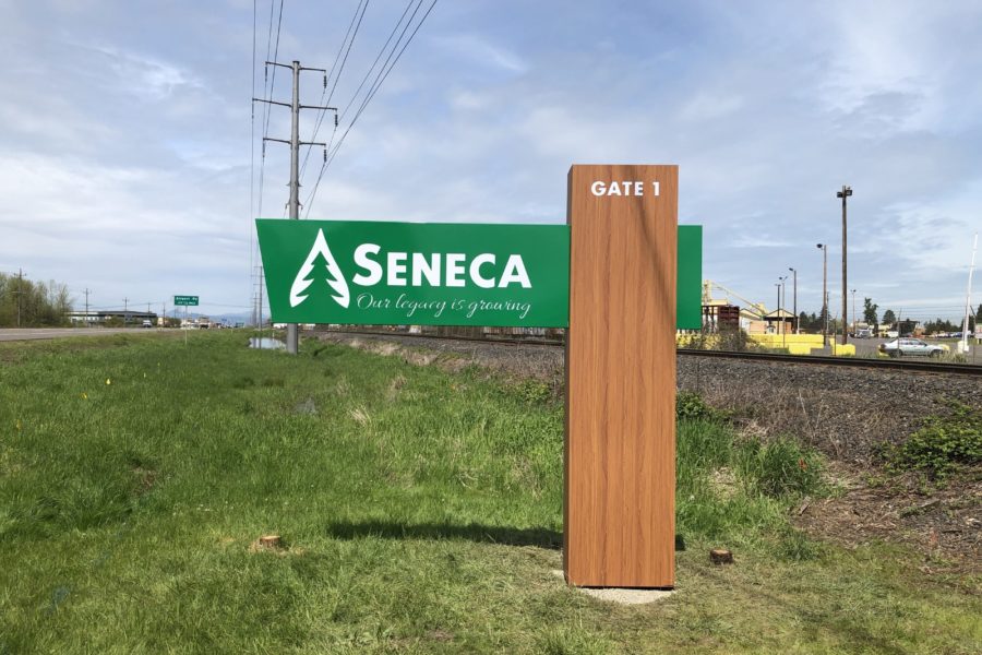
Seneca Family of Companies was established in 1954 and has carried a renowned legacy for being a family-owned and sustainable business. The name Seneca and even their iconic script font have become synonymous with good forestry practices. Seneca brought in FPW Media to implement a brand refresh while retaining the heritage and storied nature of their brand as well as ensuring that they remained recognizable in their industry. We were subsequently tasked with creating a new and highly iconic entry sign for Gate 1 of the Seneca Sawmill facility.
Scope
- Graphic Design | Redesigned a new logo, created Brand Guidelines, and deployed logo across all digital and physical assets.
- Merch | Designed, sourced, and decorated apparel.
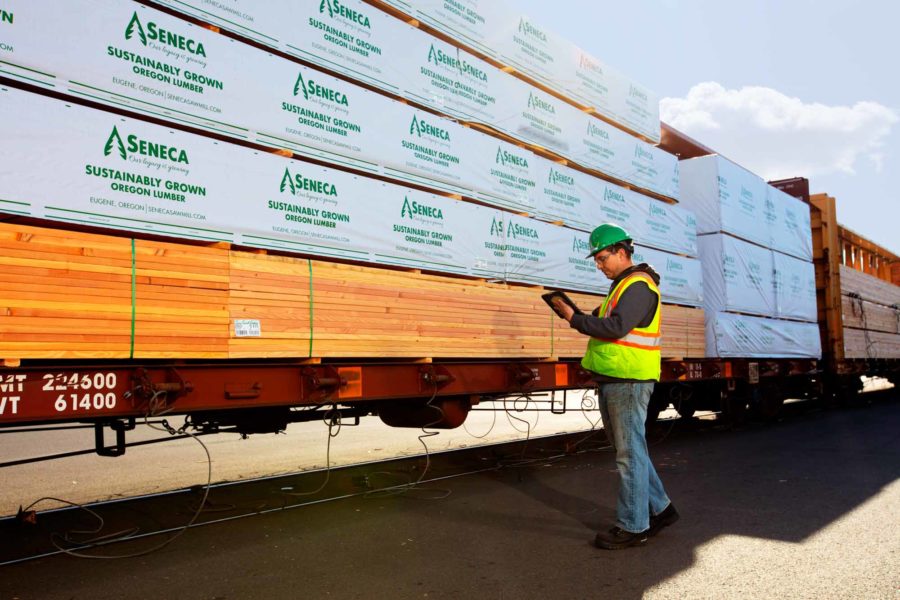
- Product Packaging | Redesigned branded lumber packaging wraps.
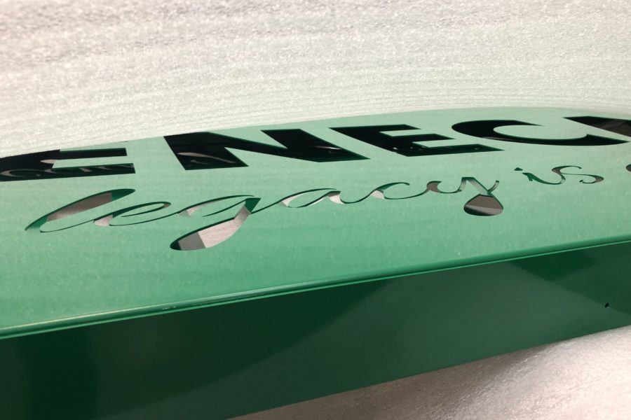
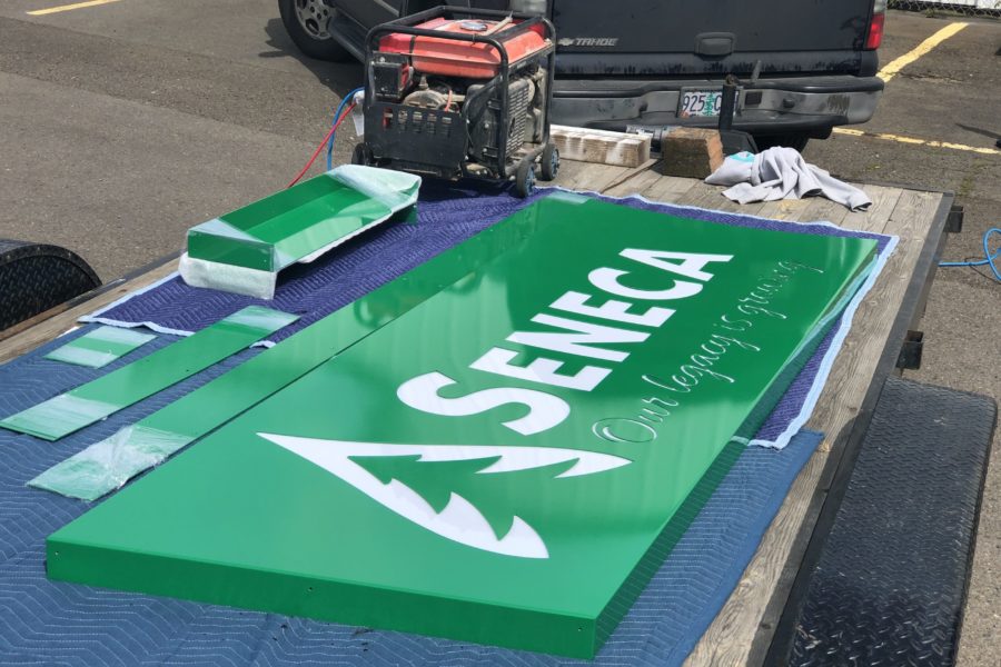
- Signage | Provided and coordinated concept design, engineering, graphic design, fabrication, and manufacture of custom Gate 1 sign.
Logo Design & Deployment
Our design team developed a water droplet tree icon to highlight both the internal and external sustainability and growth of Seneca. We worked to utilize a modern take on their logo that continued to pay homage to the rich history of the company. We integrated the new logo across all digital and physical assets, including business cards, email signatures, apparel, product packaging, and product stamps.
Apparel
Our team designed and sourced Seneca apparel for men, women, and youth, including polos, t-shirts, long-sleeved shirts, jackets, sweatshirts, caps, and beanies. FPW then facilitated the screenprinting and embroidery of each item.
Lumber Wraps
This lumber wrap redesign incorporated the mention of Eugene as Seneca’s location in order to highlight where the products were produced. This is a crucial distinction due to the sustainable legacy of Oregon forestry—and of Seneca in particular. Seneca is not merely a commodity lumber manufacturer—their brand is synonymous with quality.
Sign Design Methodology
Our design team drew inspiration from trees—the fundamental element of the lumber industry—as well as the heritage of Oregon State Park signage, incorporating Seneca’s pride in identifying as an Oregonian lumber manufacturer. We produced a cantilever design, deploying seamless construction techniques to ensure that the physical design completely emulated the proposed design. We set up a remote solar cell separate from the sign to power the sign’s internally illuminated lettering, in order to avoid distracting from the look and feel of the sign.
Results
We worked directly with Seneca’s board to ensure that, at each stage of the logo development, all elements and assets looked and felt consistent. Within two months of the initial ask in April 2018, a new logo had been designed and approved. Implementation across all assets began in June 2018. One month later, in July, all assets had been updated with the new logo.
We oversaw the sign installation process to confirm the accuracy of location, handle all troubleshooting, and ensure that the end product matched the original concept. Due to the vertical integration of FPW’s divisions and partners, we ensured that the concept was brought to reality in the precise way it was envisioned.


